Materials used in the study and results:


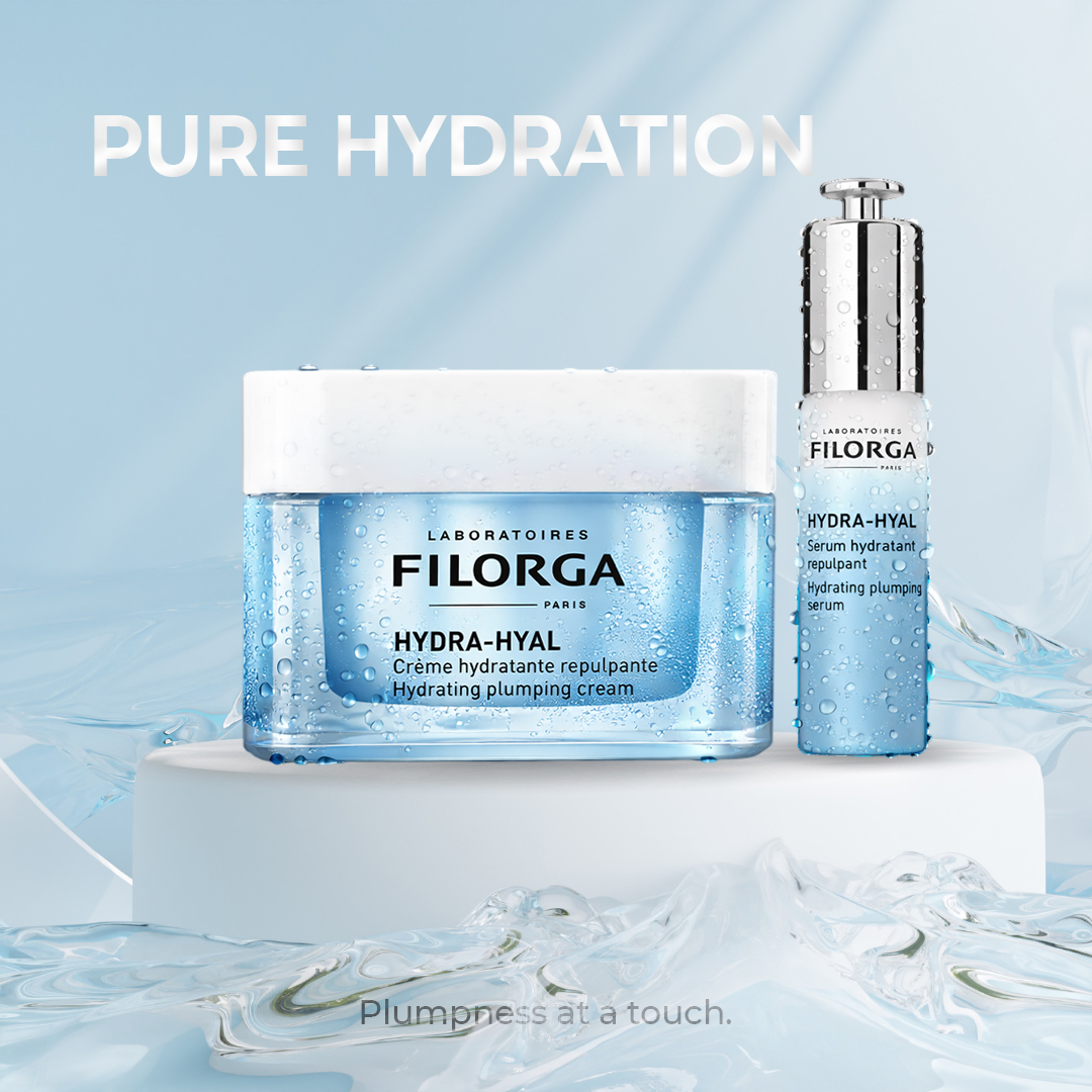
This project is a conceptual skincare advertising design created to highlight hydration, freshness, and premium quality.
The composition focuses on clean forms, soft lighting, and water-inspired elements to visually communicate deep moisture and skin plumpness.
The products are placed at the center of the scene to ensure strong brand visibility, while transparent water textures and subtle reflections reinforce the hydration concept without overwhelming the layout.
Typography is kept minimal and positioned for high readability, especially in outdoor advertising formats.
The design was tested through billboard and urban mockups to evaluate real-world impact, scale, and legibility.
This project demonstrates my approach to cosmetic product visuals, combining clarity, elegance, and commercial usability.
This project uses Montserrat, selected to support clarity, hierarchy, and the overall visual tone of the design.
Tools: Photoshop